

Simple Responsive Menu Pro 1.03
Simple Responsive Menu Pro is an enhanced version of our popular free menu module, Simple Responsive Menu.
The differences are:
- The pro version can use text or an image as the mobile menu link.
- The mobile menu is custom HTML, fully stylable with CSS, instead of a simple select list.
- The pro version supports the "new window" menu options, which is not possible with the basic version.
| نمایش ها | 3,043 | دانلودها | 7 |
|---|---|---|---|
| نسخه: | 1.03 | ايجاد شده | 1399-11-15 |
| سيستم | Joomla 3 & 4 | به روز رسانی در | 1399-11-16 |
| وب سايت | صفحه نخست  |
توسعه دهنده |
Les Arbres Design |
| مجوز | GNU/GPL |
قيمت | 20 £ EUR |
On a wide enough screen, this page has a vertical menu on the right hand side. Below 800 pixels wide it changes to a hamburger at the top left. Try it.
Clicking the hamburger opens a smaller version of the menu, styled by one of the supplied CSS files. You can configure the screen width where the switch takes place.
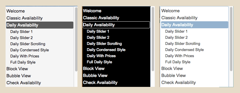
Simple Responsive Menu Pro comes with a choice of hamburger icons, or you can use your own, or use text.
It currently has a choice of three styles for the mobile menu, or you can make your own.
فقط کاربران عضو سایت پس از ورود به سایت قادر به دانلود این فایل می باشند.
نوشتن دیدگاه